


PT
Flor de Lótus é o nome da loja de roupas e acessórios fundada por uma mulher extraordinária: minha mãe.
Após ser dispensada do seu antigo emprego, ao invés de se desesperar, ela decidiu agir. Utilizou o dinheiro da rescisão para adquirir algumas peças de roupa. Colocou tudo em uma sacola jeans e saiu para vender pela cidade. Esse acontecimento foi em 2014. Após alguns anos, para ser mais exato, em 2017, abriu sua loja física com o nome Flor de Lótus, que para ela tinha um grande significado, pois assim como ela, é uma linda flor que nasceu da lama.
__________
EN
Lotus Flower is the name of the clothing and accessories store founded by an extraordinary woman: my mother.
After being made redundant from her old job, instead of despairing, she decided to take action. She used her severance money to buy some clothes. She put everything in a jeans bag and went out to sell them around town. That was in 2014. After a few years, in 2017 to be precise, she opened her physical store under the name Lotus Flower, which had great meaning for her, because just like her, it is a beautiful flower that was born from mud.


PT
Símbolo
um dos desafios deste projeto foi representar o símbolo da lótus sem torná-lo genérico, ao mesmo tempo em que trouxemos uma abordagem mais moderna.
Conhecendo muito bem a cliente (minha mãe) e sabendo o que é mais importante em sua vida, pois ela sempre deixa isso claro, optei por usar as iniciais dos três filhos dela: Sindy, Erick e Larissa.
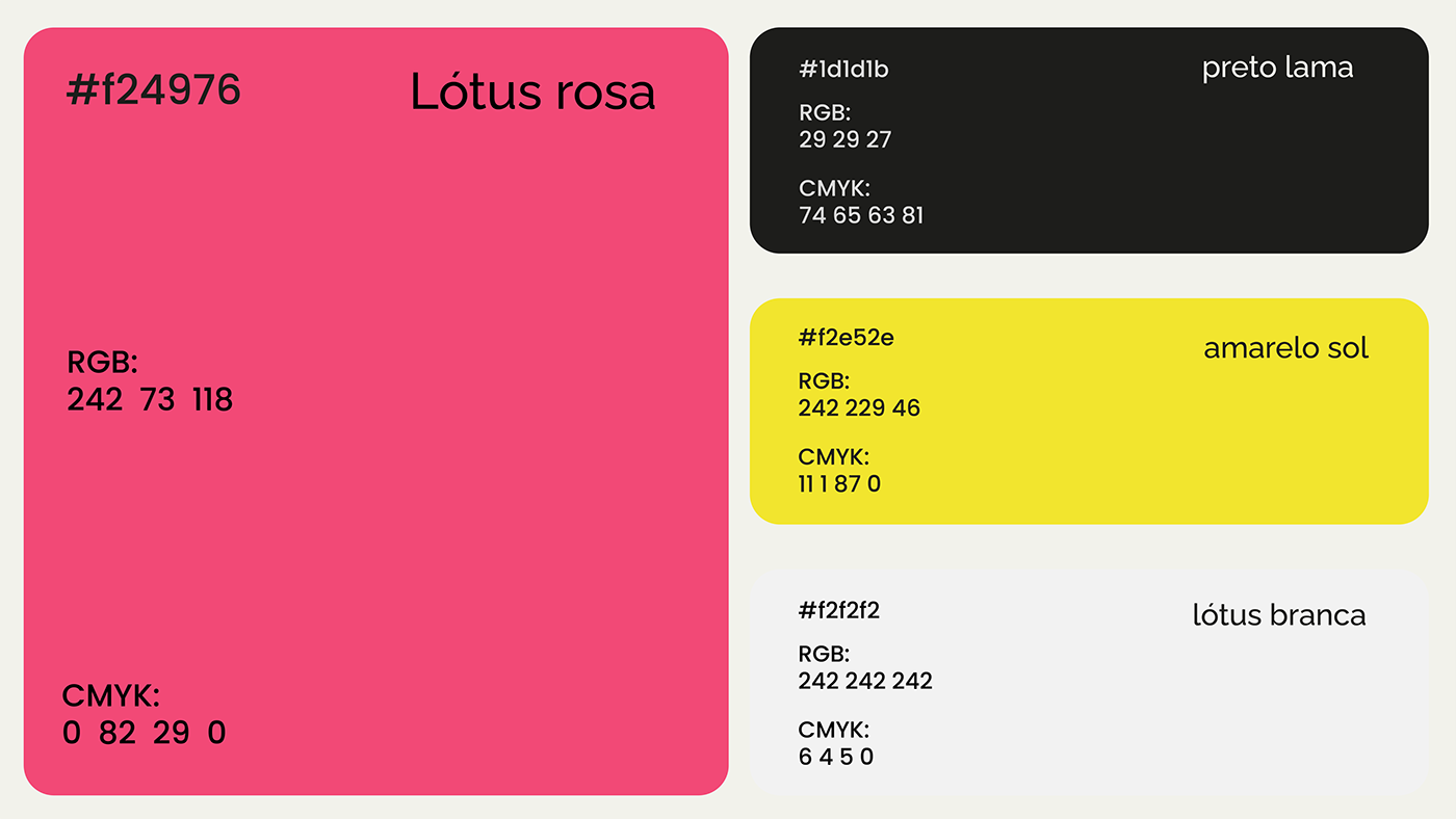
A cliente escolheu duas cores para fazer parte de sua identidade visual: o Pink, frequentemente associado a sentimentos de amor, gentileza, carinho e feminilidade, e o preto, ligado à elegância e força.
__________
EN
Symbol
one of the challenges of this project was to represent the lotus symbol without making it generic, while at the same time taking a more modern approach.
Knowing the client (my mother) very well and knowing what is most important in her life, as she always makes this clear, I chose to use the initials of her three children: Sindy, Erick and Larissa.
The client chose two colors to be part of her visual identity: Pink, often associated with feelings of love, kindness, affection and femininity, and black, linked to elegance and strength.


Cliente: Flor de Lotus
Responsável: Estúdio Raven
Designer: Erick Martins
Instagram: @martins.erick | @raven.estudio.dsgn
estudioraven.dsgn@gmail.com
Instagram: @martins.erick | @raven.estudio.dsgn
estudioraven.dsgn@gmail.com


